I am happy to share with you a tutorial by FiretruckMama who very generously wrote this for us.
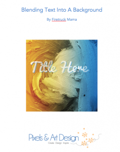
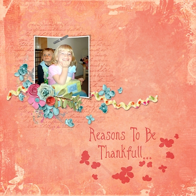
Instead of having a title that appears to be floating above the background, like this:

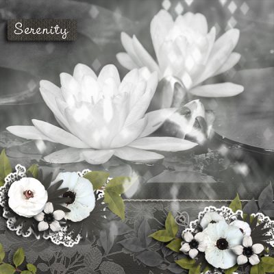
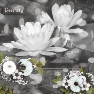
…why not have it be part of the background, like this?
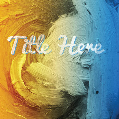
Using the “Blend If” tool in Photoshop, you can create this more realistic effect for titles on heavily textured backgrounds in your layouts.
Note: How much to have your title blend into the background is a personal preference. This tutorial provides guidelines on how to achieve the effect. However, it not an exact science and will require some trial and error on your own layouts.
Creating an Effective Title
Typically there are three things to consider before creating a blended title:
Typeface
This includes not only the font, but also the boldness and size. A small thin font, such as Helvetica, may not be as effective a title as a pre-distressed font such as Subway Novella.
Background Texture
A heavily textured background, such as layered plaster, is rougher than smooth paint.
Title Placement
Where your title appears on the page often affects how much fading the title requires. The title may fade into the background more in darker areas of the layout.
Example.
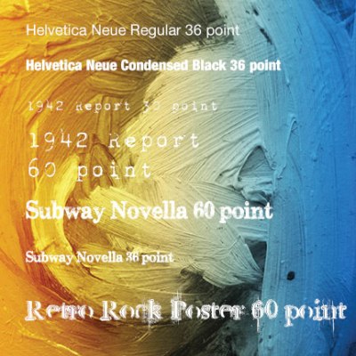
From the example above, the larger and bolder the font, the easier it is to see on the background.
With the above three things in mind, let’s get started.
Step 1: Open your background and add some type.
In this example, I used one of the papers from the Welcome Kit by NutkinTailz Designs. I added a new type layer. The font is Pacifio, size 100. I copied the title, changed the colour, and created a “shadow” for the title to make it stand out on the page. I then merged the two title layers together.
Example 1 – Background.
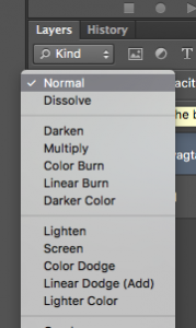
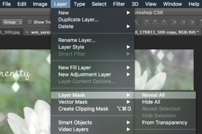
Step 2: Add a Blending Option
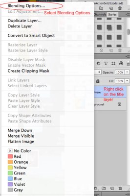
Select the title layer. Right-click on it. A fly-out menu appears. Select Blending Options at the top of the menu.
Example 2 – The Layer Options Menu.
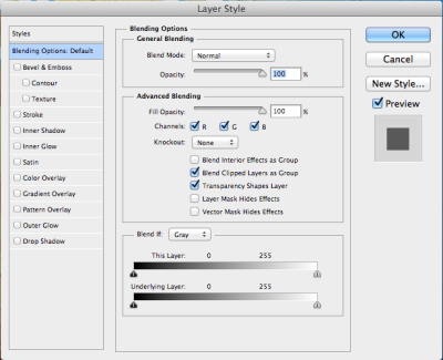
The Layer Style Menu appears.
Example 3 – Layer Style Menu.
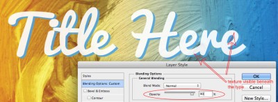
Step 3: Reduce the Opacity
Reducing the opacity of the title helps achieve a slightly worn and faded look. Depending upon the size of the title, the Opacity can be reduced from 100 to between 90 and 95%.
Example 4 – Reducing the Opacity allows the background to show through the type.
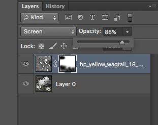
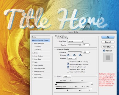
Step 4: Blend If options
The “Blend If:” section is at the bottom of the Layers Style Menu.
Example 5 – Blend if options.
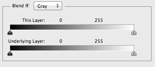
There are two bars in this section. At first glance they look identical. They both have a gradation from black to white along with black and white sliders underneath them. However, they do different things.
The top bar is labeled “This Layer.” This bar affects the currently selected layer.
The bottom bar is labeled “Underlying Layer.” This bar affects every layer below the currently selected layer.
Underneath each bar are two sliders – one black and the other white.
The black slider affects the darkest areas of the layers. The white slider affects the lightest areas of the layers. The further the sliders are moved toward the opposite direction, the greater the range being affected.
Moving the sliders for the top bar causes areas of the currently selected layer to disappear from view.
Moving the sliders for the bottom bar causes areas of the layer(s) beneath the currently selected layer to show through the selected layer.
Blend If: This Layer versus Blend If: Underlying Layer Examples
While the above explains how this works, it is much easier seeing this section in action.
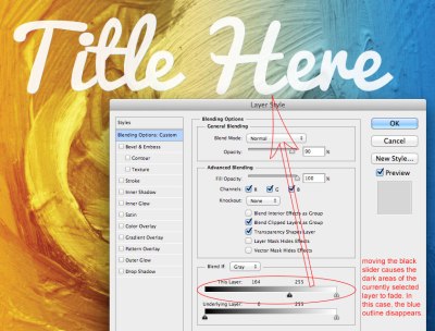
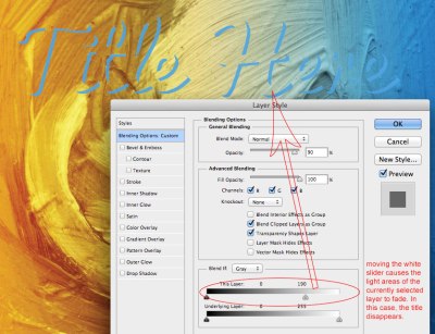
Blend If: This Layer
In examples 6 & 7 below, only the “Blend If: This Layer” bar has been modified. As the title layer is selected, only that layer is affected by the changes.
In Example 6, the black slider is moved to 164. Notice that the blue shadow around the title has disappeared. The black slider affects the darkest areas of the layer, in this case the blue shadow.
Example 6 – Blend if: This layer black slider moved.
In Example 7, the white slider is moved to 190. Notice that the white title has disappeared. The white slider affects the lightest areas of the layer, in this case the white text.
Example 7 – Blend If: This layer white slider moved.
As the type should look as if it was painted onto the background, the background needs to show through the type. In this case, modifying the “Blend If: This Layer” bar doesn’t create the desired effect.
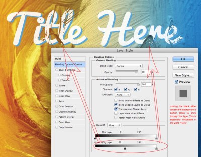
Blend If: Underlying Layer
In examples 8 & 9 below, only the “Blend If: Underlying Layer” bar has been modified. As the title layer is selected, the underlying layer, in this case the background, is affected by the changes.
In Example 8, the black slider is moved to 123. Notice that the background shows through the title in a number of places. This is especially evident in the word “Here,” where there is a dark patch in the background and the letters E and R appear to be painted atop this section.
Example 8 – Blend If : Underlying Layer black slider moved.
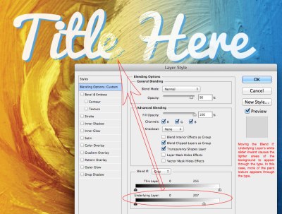
In Example 9, the white slider is moved to 207. Notice that some of the letters appear faded into the background.
Example 9 – Blend If: Underlying layer white slider moved.
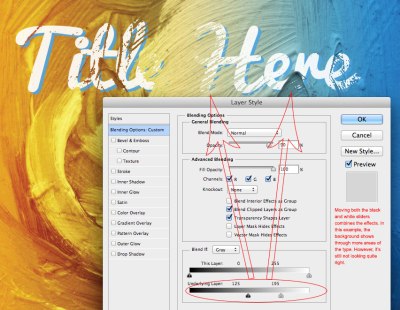
The above examples show that modifying the “Blend If: Underlying Layer” bar is the way to produce a faded title effect. Example 10 shows both sliders moved, creating a better-faded text effect.
Example 10 – Blend If: Underlying layer with both sliders moved.
Although this looks more realistic than just adjusting one of the sliders, it isn’t quite true to life. The title is either showing or it isn’t. There isn’t a transition, or fading, in the title. A transition must be created to make it appear more realistically faded into the background. To do that, the sliders need to be split.
Step 5: Split the sliders and adjust as necessary.
To create more of a transition between the two layers, hold down the Alt (Window) / Option(Mac) key and click the black slider. This causes the slider to split in half. (If the slider doesn’t split in half, drag one side of the slider to one direction instead.) Example 11 shows both sliders split:
Example 11 – Sliders Split.
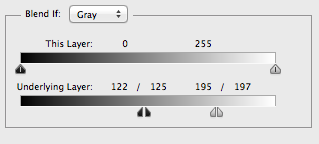
With the black slider now split in two, there is more control over where the blending begins and ends. The left slider notes where the blending begins. The right slider notes where the blending ends. The range between is the amount of transition. Unfortunately here’s no set range for backgrounds, so some manipulation is required to get the desired effect.
In Example 12, the range of black is 82 to 162 and the range of white is 178 to 234.
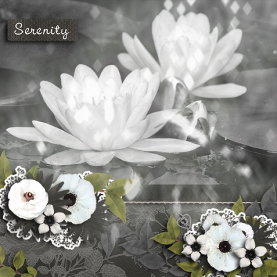
Example 12 – Final result.
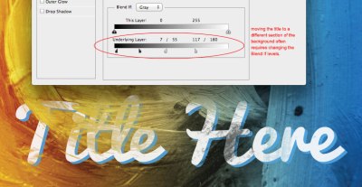
Example 13 shows the importance of where the title is placed. For this example, I duplicated the title and moved it to the bottom of the background. It was nearly impossible to view on the background as there was a lot more black in this lower section. So, I reopened the Blending Options menu and moved the sliders until the title looked more realistic.
Example 13 – Moving the title required adjusting of the sliders.
What about other backgrounds – such as wood or fabric? This technique works on them too.

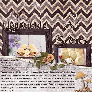
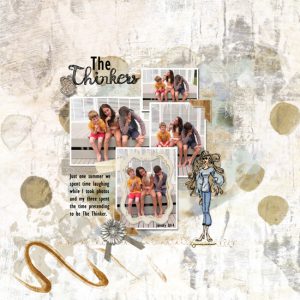
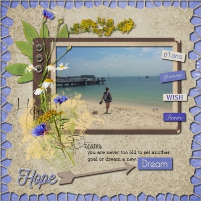
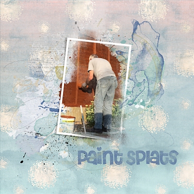
Some Sample layouts.

Have fun with this technique.
Download the PDF file here.